Leonardo Capitani
  • Home
  • Research Projects
  • Learning
  • Open Science
  • Science Communication
  • Consulting
  • Contact
  1. Ecological Modelling
  2. Empirical Dynamic Modelling: intro
  • All notebooks
  • Open Science
    • Registered Reports: what are they?
  • Ecological Modelling
    • Empirical Dynamic Modelling: intro
    • Convergent Cross Mapping
    • Gaussian Processes
    • Ecopath with Ecosim (Rpath)
  • Statistics
    • Priors
    • Measurement Error
    • Sample Size Planning

On this page

  • Why not just fit a regression?
  • The core idea: rebuilding an attractor from one time series
  • Step 1 — Simplex projection: forecasting by analogy
    • Picking \(E\)
  • Is it chaos, or is it just noise?
  • Step 2 — S-map: does the “rulebook” change with the state of the system?
  • Trying it on a real population
  • Step 3 — S-map coefficients: reading off interaction strength
  • Step 4 — Multiview embedding: letting the data pick the best variables
  • Take-home
  • Further reading
  1. Ecological Modelling
  2. Empirical Dynamic Modelling: intro

Empirical Dynamic Modelling: an introduction

  • Show All Code
  • Hide All Code

  • View Source
Author

Leonardo Capitani

Published

July 22, 2026

Modified

July 25, 2026

Code
library(rEDM)
library(tidyverse)

Why not just fit a regression?

You’ve got a population time series and you want to know what drives it. The reflex move is a regression, or maybe an ARIMA model. Here’s the problem with that:

  • Regression assumes a fixed relationship: a 1-unit change in \(X\) always buys you the same change in \(Y\).
  • Ecological systems are usually state-dependent: the effect of a predator on its prey can flip sign depending on whether prey are scarce or abundant, whether the system is near a tipping point, and so on.
  • This gives you “mirage correlations” — correlations between two variables that appear, vanish, and reverse over time, even though the two variables are genuinely causally linked the whole time (Chang et al. 2017).

Q: So what do I do instead? A: You stop trying to write down the equations, and instead let the data reconstruct the dynamics for you. That’s Empirical Dynamic Modelling (EDM) — a non-parametric, nonlinear alternative to regression, built for exactly this kind of system (Chang et al. 2017).

The core idea: rebuilding an attractor from one time series

Here’s the counterintuitive part.

  • Say you only measured one species in a multi-species food web. Surely you’ve lost all the information about the other species?
  • Not quite: if that species interacts with the rest of the system, its own trajectory carries a “shadow” of everything it interacts with.
  • Takens’ theorem says you can recover that shadow using nothing but lagged copies of your one time series.

Q: How, mechanically? A: You build an embedding — a vector of \(E\) lagged values of your series:

\[ \vec{x}_t = (x_t,\ x_{t-\tau},\ x_{t-2\tau},\ \dots,\ x_{t-(E-1)\tau}) \]

  • \(E\) = the embedding dimension — how many lags you use.
  • \(\tau\) = the time delay between lags (I’ll use \(\tau=1\) throughout, one time step).
  • Plot these vectors in \(E\)-dimensional space and you get a “shadow manifold” — a reconstruction of the system’s attractor that shares its essential shape (topology) with the real thing.

You never see the real attractor. You don’t need to: the shadow is enough to forecast from.

Step 1 — Simplex projection: forecasting by analogy

The simplest EDM forecasting method is Simplex projection, and the logic is just “find what happened last time things looked like this”:

  • Embed the series into \(E\) dimensions.
  • For the point you want to forecast, find its \(E+1\) nearest neighbours in the embedded space (using only points from the past, i.e. your “library”).
  • Forecast = a distance-weighted average of what those neighbours did next.

That’s it — no equations, no parameters to fit, just pattern-matching in the reconstructed state space.

Q: What counts as a good population model to try this on? A: A chaotic one. Robert May showed back in 1976 that ridiculously simple population models (like a discrete logistic map) can produce dynamics so complex they look like noise — but they aren’t. I’ll use TentMap, a textbook chaotic map bundled with rEDM, as a stand-in for a “simple but chaotic” single-species population.

Picking \(E\)

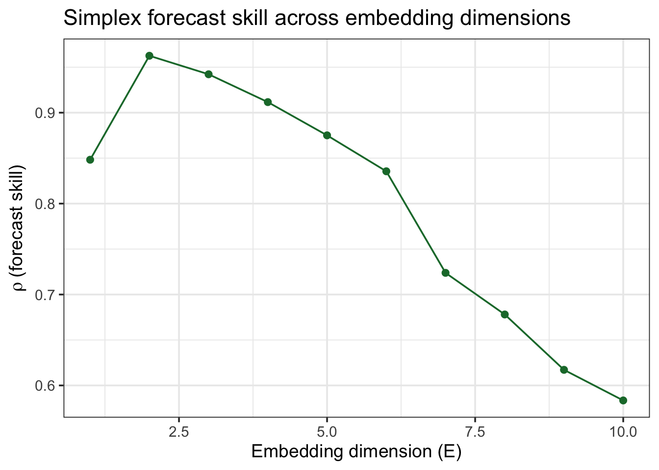
I don’t get to pick \(E\) by intuition — I let forecast skill tell me. I split the series into a library (used to search for neighbours) and a prediction set (held out, forecasted), then try a range of \(E\) values:

Code
lib_range  <- "1 100"
pred_range <- "201 500"

E_test <- EmbedDimension(
  dataFrame = TentMap, lib = lib_range, pred = pred_range,
  columns = "TentMap", target = "TentMap", showPlot = FALSE
)

E_test |>
  ggplot(aes(x = E, y = rho)) +
  geom_line(color = "#1B7837") +
  geom_point(size = 2, color = "#1B7837") +
  labs(x = "Embedding dimension (E)", y = expression(rho~"(forecast skill)"),
       title = "Simplex forecast skill across embedding dimensions") +
  theme_bw(base_size = 14)
Code
best_E <- E_test$E[which.max(E_test$rho)]
best_E
[1] 2

Q: What am I looking for in that plot? A: A peak. Too few dimensions and the reconstruction folds different states on top of each other (bad neighbours); too many and I’m fitting noise. The peak — here \(E = 2\) — is my best embedding.

Is it chaos, or is it just noise?

This question is where EDM started: Sugihara and May showed that nonlinear forecasting like this could tell real deterministic chaos apart from measurement error in ecological and epidemiological time series (think measles, chickenpox) — cases where a simple linear analysis just sees “noise” (Sugihara & May 1990). Here’s the diagnostic: forecast the series at increasing horizons (\(T_p = 1, 2, 3, \dots\)) and watch what happens to forecast skill.

  • Chaotic systems: skill decays smoothly with horizon (small errors compound — the “butterfly effect”).
  • Noise: skill is already bad at \(T_p=1\) and stays flat and low.
Code
horizon_chaos <- PredictInterval(
  dataFrame = TentMap, lib = lib_range, pred = pred_range,
  E = best_E, columns = "TentMap", target = "TentMap", showPlot = FALSE
) |> mutate(series = "Chaotic (TentMap)")

horizon_noise <- PredictInterval(
  dataFrame = TentMapNoise, lib = lib_range, pred = pred_range,
  E = best_E, columns = "TentMap", target = "TentMap", showPlot = FALSE
) |> mutate(series = "Noise (TentMapNoise)")

bind_rows(horizon_chaos, horizon_noise) |>
  ggplot(aes(x = Tp, y = rho, color = series)) +
  geom_line(linewidth = 1) +
  geom_point(size = 2) +
  scale_color_manual(values = c("#1B7837", "grey60")) +
  labs(x = "Prediction horizon (Tp, steps ahead)", y = expression(rho),
       color = NULL, title = "Forecast skill vs. prediction horizon") +
  theme_bw(base_size = 14)
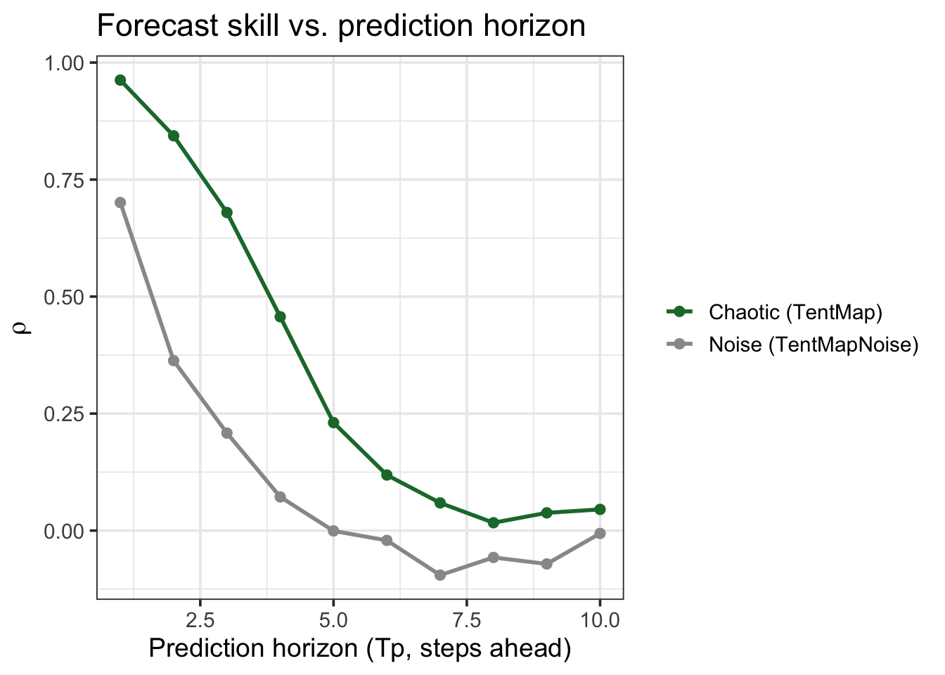
Q: Why does this matter for a real dataset? A: If your population’s forecast skill degrades gradually like the chaotic curve, you have a deterministic but unpredictable-in-the-long-run system — a completely different management problem than pure noise (where more monitoring effort won’t buy you better forecasts).

Step 2 — S-map: does the “rulebook” change with the state of the system?

Simplex gives you a forecast; S-map (Sugihara 1994) (sequential locally weighted global linear map) gives you something more diagnostic: it fits a local linear model around each point, weighting neighbours by

\[ w(d) = \exp\!\left(-\theta \frac{d}{\bar d}\right) \]

  • \(d\) = distance to a neighbour, \(\bar d\) = average distance.
  • \(\theta = 0\): every point gets equal weight → one global linear model (this is just standard linear autoregression).
  • \(\theta > 0\): nearby points matter more → the “rules” are allowed to change across the state space (state-dependence, i.e. nonlinearity).

Q: How does this tell me the system is nonlinear? A: If forecast skill improves as \(\theta\) increases above 0, a single fixed rule can’t explain your data — the best-fitting local model changes depending on where you are on the attractor. That is itself evidence of nonlinear, state-dependent dynamics.

Code
theta_test <- PredictNonlinear(
  dataFrame = TentMap, lib = lib_range, pred = pred_range,
  E = best_E, columns = "TentMap", target = "TentMap", showPlot = FALSE
)

theta_test |>
  ggplot(aes(x = Theta, y = rho)) +
  geom_line(color = "#1B7837") +
  geom_point(size = 2, color = "#1B7837") +
  labs(x = expression(theta~"(local weighting / nonlinearity)"), y = expression(rho),
       title = "S-map: does nonlinearity improve forecast skill?") +
  theme_bw(base_size = 14)
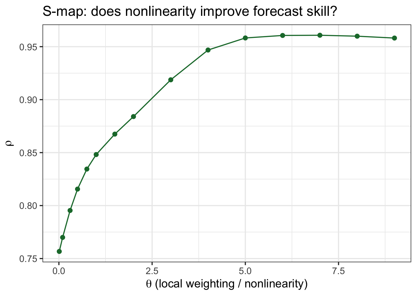
The peak sits well above \(\theta = 0\): a single global linear rule underfits this system — exactly what I’d expect from a chaotic map, and exactly the pattern you should look for before assuming a linear model is good enough for your own data.

Trying it on a real population

rEDM ships a real dataset I like a lot for this: monthly counts of Thrips imaginis (an insect) in South Australia, alongside rainfall and temperature — a genuine, noisy, real-world ecological time series, not a toy.

Code
data(Thrips)
Thrips |> select(Year, Month, Thrips_imaginis) |> head()
  Year Month Thrips_imaginis
1 1932     4             4.5
2 1932     5            23.4
3 1932     6            17.8
4 1932     7             4.4
5 1932     8             3.3
6 1932     9            34.0

Q: Same two questions as before — what E, and is it nonlinear?

Code
lib_thrips <- paste("1", nrow(Thrips))

E_thrips <- EmbedDimension(
  dataFrame = Thrips, lib = lib_thrips, pred = lib_thrips,
  columns = "Thrips_imaginis", target = "Thrips_imaginis", showPlot = FALSE
)
best_E_thrips <- E_thrips$E[which.max(E_thrips$rho)]

theta_thrips <- PredictNonlinear(
  dataFrame = Thrips, lib = lib_thrips, pred = lib_thrips,
  E = best_E_thrips, columns = "Thrips_imaginis", target = "Thrips_imaginis",
  showPlot = FALSE
)

theta_thrips |>
  ggplot(aes(x = Theta, y = rho)) +
  geom_line(color = "#1B7837") +
  geom_point(size = 2, color = "#1B7837") +
  labs(x = expression(theta), y = expression(rho),
       title = paste0("Thrips imaginis, E = ", best_E_thrips)) +
  theme_bw(base_size = 14)
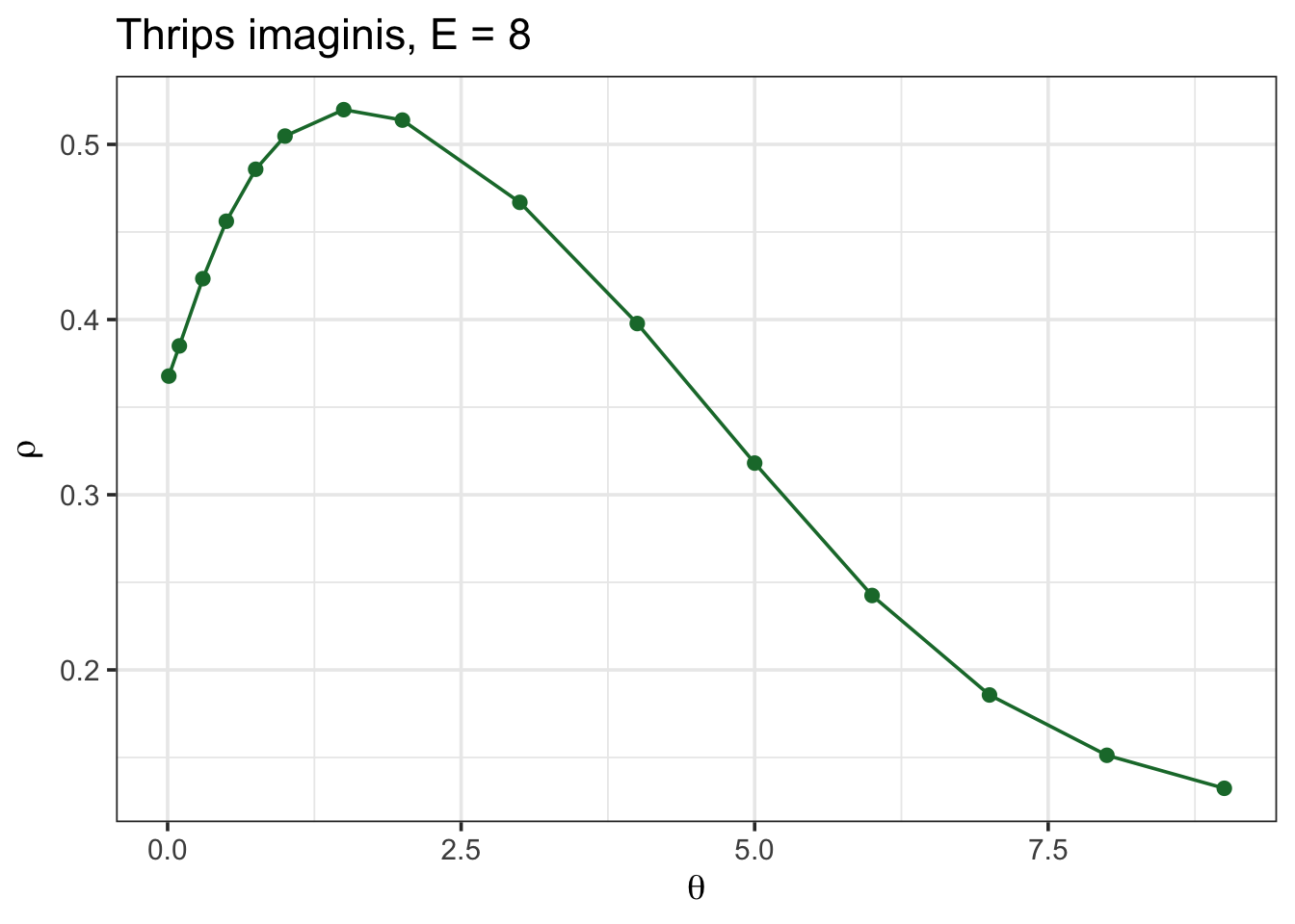
Forecast skill is far from perfect (real insect counts are noisy), but it clearly rises above the linear (\(\theta=0\)) baseline — a real population, not a simulation, showing the same nonlinear signature I built into the chaotic toy example above.

Step 3 — S-map coefficients: reading off interaction strength

So far I’ve only used S-map’s forecast skill. But since S-map fits an actual local linear model at every point, I can also look at its coefficients — and if I embed more than one species together, those coefficients are interpretable as time-varying interaction strengths (essentially, a Jacobian): “how much does a change in species \(j\) move species \(i\), right now, given the current state of the system?” (Sugihara 1994)

I’ll use block_3sp, a bundled 3-species dataset already lagged for me:

Code
data(block_3sp)
species_cols <- c("x_t", "y_t", "z_t")
block_3sp |> select(time, all_of(species_cols)) |> head()
  time        x_t         y_t         z_t
1    3 -1.9176852 -0.11318805  1.53523878
2    4 -0.9623176 -1.10677859 -1.49295576
3    5  1.3318751  2.38504081 -1.11947621
4    6 -0.8170829 -0.67534628  0.74665790
5    7  0.7435860 -0.01063935  0.06308867
6    8 -1.2801732  1.01914161  0.81223516
Code
smap_out <- SMap(
  dataFrame = block_3sp, lib = "1 100", pred = "101 190", E = 3,
  columns = species_cols, target = "x_t", embedded = TRUE, theta = 2,
  showPlot = FALSE
)

smap_out$coefficients |>
  rename(effect_of_x = 3, effect_of_y = 4, effect_of_z = 5) |>
  select(time, effect_of_x, effect_of_y, effect_of_z) |>
  pivot_longer(-time, names_to = "predictor", values_to = "coefficient") |>
  ggplot(aes(x = time, y = coefficient, color = predictor)) +
  geom_line(linewidth = 0.8) +
  geom_hline(yintercept = 0, linetype = "dashed", color = "grey50") +
  scale_color_manual(values = c("#1B7837", "#762A83", "#2166AC"),
                      labels = c("effect of x on x", "effect of y on x", "effect of z on x")) +
  labs(x = "Time", y = "S-map coefficient", color = NULL,
       title = "Time-varying effect of x, y and z on species x") +
  theme_bw(base_size = 14) +
  theme(legend.position = "bottom")
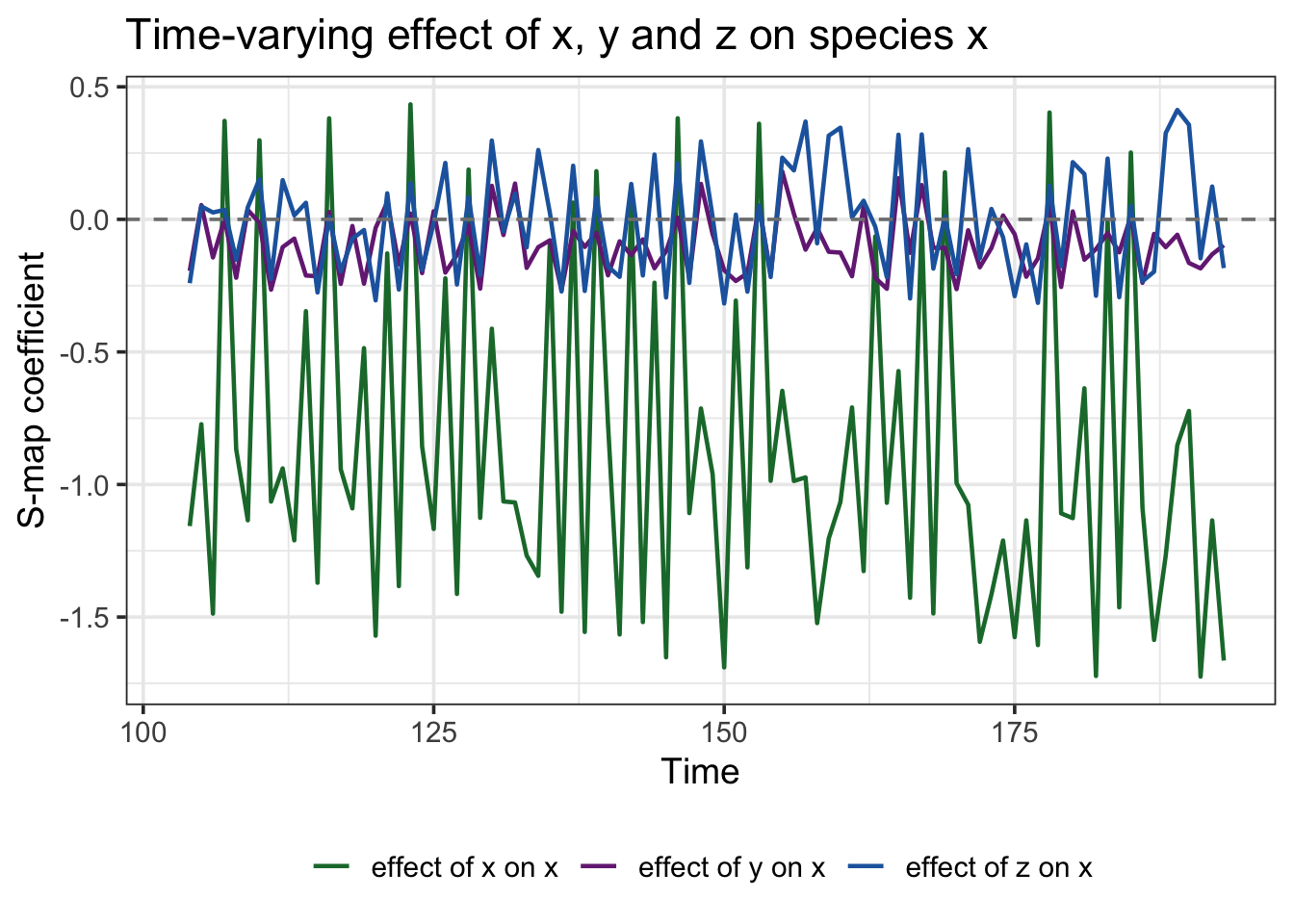
Q: why not just fit one regression coefficient per pair of species and be done with it? A: Because in a nonlinear system that single number is a lie by omission — the true effect of \(y\) on \(x\) isn’t constant, it depends on the state you’re in. The plot above is that dependence, made visible: the “effect of \(y\) on \(x\)” line isn’t flat, it swings around zero as the system moves through different parts of its attractor.

Step 4 — Multiview embedding: letting the data pick the best variables

Everything above used one fixed embedding. Multiview asks: what if I don’t have to commit to one? Ye and Sugihara’s approach is refreshingly simple (Ye & Sugihara 2016):

  • Build every candidate embedding of dimension \(E\) you can make out of your observed variables (including different lags).
  • Rank them by in-sample forecast skill.
  • Forecast using the top-ranked ones, and average the results.

Q: doesn’t that risk overfitting — cherry-picking whatever worked in-sample? A: A little, which is why you average several good embeddings rather than keeping only the single best one — that’s what tames the cherry-picking. Let’s check whether it actually beats a plain univariate forecast on the same 3-species system:

Code
uni_out <- Simplex(
  dataFrame = block_3sp, lib = "1 100", pred = "101 195",
  E = 3, columns = "x_t", target = "x_t", showPlot = FALSE
)
uni_rho <- ComputeError(uni_out$Observations, uni_out$Predictions)$rho

mv_out <- Multiview(
  dataFrame = block_3sp, lib = "1 100", pred = "101 195",
  E = 3, columns = species_cols, target = "x_t", showPlot = FALSE
)
mv_rho <- ComputeError(mv_out$Predictions$Observations, mv_out$Predictions$Predictions)$rho

tibble(
  method = c("Univariate Simplex (x only)", "Multiview (x, y, z)"),
  rho = c(uni_rho, mv_rho)
)
# A tibble: 2 x 2
  method                        rho
  <chr>                       <dbl>
1 Univariate Simplex (x only) 0.934
2 Multiview (x, y, z)         0.941

Multiview comes out ahead, using nothing I hadn’t already measured — just letting the data decide which lagged combinations of \(x\), \(y\) and \(z\) are worth listening to, instead of me guessing.

Take-home

  • Linear correlation-based methods assume a fixed relationship. Ecological systems often don’t have one.
  • EDM sidesteps that by reconstructing the system’s attractor directly from lagged values of a time series (Takens’ theorem) — no equations required.
  • Simplex projection forecasts by analogy to the nearest neighbours in that reconstruction; sweeping \(E\) tells you the reconstruction’s dimensionality, and sweeping \(T_p\) tells you chaos from noise (Sugihara & May 1990).
  • S-map (Sugihara 1994) checks whether a local, state-dependent model beats a single global linear one — the diagnostic for nonlinearity — and its coefficients double as time-varying interaction strengths once you embed more than one variable.
  • Multiview (Ye & Sugihara 2016) lets forecast skill, not intuition, pick which combination of variables and lags to trust.
  • Everything here used one variable at a time (or, for S-map coefficients and Multiview, a handful measured together). The natural next question is interaction between variables — does species \(A\) actually drive species \(B\)? That’s what convergent cross mapping is for, next notebook.

Further reading

  • Chang et al. (2017) — a hands-on rEDM walkthrough I leaned on heavily here.
  • Time Series Analysis Handbook, ch. 5 — Simplex and S-map projections — the Python-flavoured version of everything above, with more detail on multivariate embeddings.
  • The official rEDM package vignette — covers the same ground as this notebook (Simplex, S-map, S-map coefficients, Multiview, CCM) using the package’s earlier API; a good second reference if you get stuck on syntax.
  • Sugihara & May (1990) — the founding EDM paper: using nonlinear forecasting to tell chaos from measurement error in real epidemiological time series.
  • Sugihara (1994) — introduces S-map.
  • Dixon et al. (1999) — an early, high-stakes real-world validation: forecasting larval reef-fish supply, not just toy chaotic maps.
  • Sugihara et al. (2012) — introduces Convergent Cross Mapping; the full story is in the next notebook.
  • Ye & Sugihara (2016) — introduces Multiview embedding.
  • Ye et al. (2015) — the time-lag extension to CCM, also covered in the next notebook.
Back to top

References

Chang, C.-W., Ushio, M. & Hsieh, C. (2017). Empirical dynamic modeling for beginners. Ecol Res, 32, 785–796.
Dixon, P.A., Milicich, M. & Sugihara, G. (1999). Episodic fluctuations in larval supply. Science, 283, 1528–1530.
Sugihara, G. (1994). Nonlinear forecasting for the classification of natural time series. Philosophical Transactions: Physical Sciences and Engineering, 348, 477–495.
Sugihara, G. & May, R.M. (1990). Nonlinear forecasting as a way of distinguishing chaos from measurement error in time series. Nature, 344, 734–741.
Sugihara, G., May, R., Ye, H., Hsieh, C., Deyle, E., Fogarty, M., et al. (2012). Detecting causality in complex ecosystems. Science, 338, 496–500.
Ye, H., Deyle, E.R., Gilarranz, L.J. & Sugihara, G. (2015). Distinguishing time-delayed causal interactions using convergent cross mapping. Sci Rep, 5, 14750.
Ye, H. & Sugihara, G. (2016). Information leverage in interconnected ecosystems: Overcoming the curse of dimensionality. Science, 353, 922–925.
Registered Reports: what are they?
Convergent Cross Mapping
Source Code
---
title: "Empirical Dynamic Modelling: an introduction"
author: "Leonardo Capitani"
date: "07/22/2026"
date-modified: last-modified
execute:
  echo: true
  warning: false
  message: false
format:
      html:
          toc: true
          code-fold: true
          code-tools: true
          code-link: true
          embed-resources: true
editor: visual
editor_options:
  chunk_output_type: console
bibliography: references.bib
csl: "ecology-letters.csl"
---

```{r load_libraries}
library(rEDM)
library(tidyverse)
```

## Why not just fit a regression?

You've got a population time series and you want to know what drives it. The reflex move is a regression, or maybe an ARIMA model. Here's the problem with that:

-   Regression assumes a **fixed** relationship: a 1-unit change in $X$ always buys you the same change in $Y$.
-   Ecological systems are usually **state-dependent**: the effect of a predator on its prey can flip sign depending on whether prey are scarce or abundant, whether the system is near a tipping point, and so on.
-   This gives you "mirage correlations" — correlations between two variables that appear, vanish, and reverse over time, even though the two variables are genuinely causally linked the whole time [@chang_empirical_2017].

**Q: So what do I do instead?**
A: You stop trying to write down the equations, and instead let the data reconstruct the dynamics for you. That's Empirical Dynamic Modelling (EDM) — a non-parametric, nonlinear alternative to regression, built for exactly this kind of system [@chang_empirical_2017].

## The core idea: rebuilding an attractor from one time series

Here's the counterintuitive part.

-   Say you only measured *one* species in a multi-species food web. Surely you've lost all the information about the other species?
-   Not quite: if that species interacts with the rest of the system, its own trajectory carries a "shadow" of everything it interacts with.
-   **Takens' theorem** says you can recover that shadow using nothing but lagged copies of your one time series.

**Q: How, mechanically?**
A: You build an embedding — a vector of $E$ lagged values of your series:

$$
\vec{x}_t = (x_t,\ x_{t-\tau},\ x_{t-2\tau},\ \dots,\ x_{t-(E-1)\tau})
$$

-   $E$ = the **embedding dimension** — how many lags you use.
-   $\tau$ = the **time delay** between lags (I'll use $\tau=1$ throughout, one time step).
-   Plot these vectors in $E$-dimensional space and you get a "shadow manifold" — a reconstruction of the system's attractor that shares its essential shape (topology) with the real thing.

You never see the real attractor. You don't need to: the shadow is enough to forecast from.

## Step 1 — Simplex projection: forecasting by analogy

The simplest EDM forecasting method is **Simplex projection**, and the logic is just "find what happened last time things looked like this":

-   Embed the series into $E$ dimensions.
-   For the point you want to forecast, find its $E+1$ nearest neighbours in the embedded space (using only points from the past, i.e. your "library").
-   Forecast = a distance-weighted average of what those neighbours did next.

That's it — no equations, no parameters to fit, just pattern-matching in the reconstructed state space.

**Q: What counts as a good population model to try this on?**
A: A chaotic one. Robert May showed back in 1976 that ridiculously simple population models (like a discrete logistic map) can produce dynamics so complex they look like noise — but they aren't. I'll use `TentMap`, a textbook chaotic map bundled with `rEDM`, as a stand-in for a "simple but chaotic" single-species population.

### Picking $E$

I don't get to pick $E$ by intuition — I let forecast skill tell me. I split the series into a **library** (used to search for neighbours) and a **prediction** set (held out, forecasted), then try a range of $E$ values:

```{r embed_dimension}
lib_range  <- "1 100"
pred_range <- "201 500"

E_test <- EmbedDimension(
  dataFrame = TentMap, lib = lib_range, pred = pred_range,
  columns = "TentMap", target = "TentMap", showPlot = FALSE
)

E_test |>
  ggplot(aes(x = E, y = rho)) +
  geom_line(color = "#1B7837") +
  geom_point(size = 2, color = "#1B7837") +
  labs(x = "Embedding dimension (E)", y = expression(rho~"(forecast skill)"),
       title = "Simplex forecast skill across embedding dimensions") +
  theme_bw(base_size = 14)

best_E <- E_test$E[which.max(E_test$rho)]
best_E
```

**Q: What am I looking for in that plot?**
A: A peak. Too few dimensions and the reconstruction folds different states on top of each other (bad neighbours); too many and I'm fitting noise. The peak — here $E = `r best_E`$ — is my best embedding.

## Is it chaos, or is it just noise?

This question is where EDM started: Sugihara and May showed that nonlinear forecasting like this could tell real deterministic chaos apart from measurement error in ecological and epidemiological time series (think measles, chickenpox) — cases where a simple linear analysis just sees "noise" [@sugihara_may_1990]. Here's the diagnostic: forecast the series at increasing horizons ($T_p = 1, 2, 3, \dots$) and watch what happens to forecast skill.

-   **Chaotic** systems: skill decays *smoothly* with horizon (small errors compound — the "butterfly effect").
-   **Noise**: skill is already bad at $T_p=1$ and stays flat and low.

```{r chaos_vs_noise}
horizon_chaos <- PredictInterval(
  dataFrame = TentMap, lib = lib_range, pred = pred_range,
  E = best_E, columns = "TentMap", target = "TentMap", showPlot = FALSE
) |> mutate(series = "Chaotic (TentMap)")

horizon_noise <- PredictInterval(
  dataFrame = TentMapNoise, lib = lib_range, pred = pred_range,
  E = best_E, columns = "TentMap", target = "TentMap", showPlot = FALSE
) |> mutate(series = "Noise (TentMapNoise)")

bind_rows(horizon_chaos, horizon_noise) |>
  ggplot(aes(x = Tp, y = rho, color = series)) +
  geom_line(linewidth = 1) +
  geom_point(size = 2) +
  scale_color_manual(values = c("#1B7837", "grey60")) +
  labs(x = "Prediction horizon (Tp, steps ahead)", y = expression(rho),
       color = NULL, title = "Forecast skill vs. prediction horizon") +
  theme_bw(base_size = 14)
```

**Q: Why does this matter for a real dataset?**
A: If your population's forecast skill degrades gradually like the chaotic curve, you have a *deterministic but unpredictable-in-the-long-run* system — a completely different management problem than pure noise (where more monitoring effort won't buy you better forecasts).

## Step 2 — S-map: does the "rulebook" change with the state of the system?

Simplex gives you a forecast; **S-map** [@sugihara_1994] (sequential locally weighted global linear map) gives you something more diagnostic: it fits a *local* linear model around each point, weighting neighbours by

$$
w(d) = \exp\!\left(-\theta \frac{d}{\bar d}\right)
$$

-   $d$ = distance to a neighbour, $\bar d$ = average distance.
-   $\theta = 0$: every point gets equal weight → one **global** linear model (this is just standard linear autoregression).
-   $\theta > 0$: nearby points matter more → the "rules" are allowed to change across the state space (**state-dependence**, i.e. nonlinearity).

**Q: How does this tell me the system is nonlinear?**
A: If forecast skill *improves* as $\theta$ increases above 0, a single fixed rule can't explain your data — the best-fitting local model changes depending on where you are on the attractor. That is itself evidence of nonlinear, state-dependent dynamics.

```{r smap_theta}
theta_test <- PredictNonlinear(
  dataFrame = TentMap, lib = lib_range, pred = pred_range,
  E = best_E, columns = "TentMap", target = "TentMap", showPlot = FALSE
)

theta_test |>
  ggplot(aes(x = Theta, y = rho)) +
  geom_line(color = "#1B7837") +
  geom_point(size = 2, color = "#1B7837") +
  labs(x = expression(theta~"(local weighting / nonlinearity)"), y = expression(rho),
       title = "S-map: does nonlinearity improve forecast skill?") +
  theme_bw(base_size = 14)
```

The peak sits well above $\theta = 0$: a single global linear rule underfits this system — exactly what I'd expect from a chaotic map, and exactly the pattern you should look for before assuming a linear model is good enough for your own data.

## Trying it on a real population

`rEDM` ships a real dataset I like a lot for this: monthly counts of *Thrips imaginis* (an insect) in South Australia, alongside rainfall and temperature — a genuine, noisy, real-world ecological time series, not a toy.

```{r thrips_setup}
data(Thrips)
Thrips |> select(Year, Month, Thrips_imaginis) |> head()
```

**Q: Same two questions as before — what E, and is it nonlinear?**

```{r thrips_edm}
lib_thrips <- paste("1", nrow(Thrips))

E_thrips <- EmbedDimension(
  dataFrame = Thrips, lib = lib_thrips, pred = lib_thrips,
  columns = "Thrips_imaginis", target = "Thrips_imaginis", showPlot = FALSE
)
best_E_thrips <- E_thrips$E[which.max(E_thrips$rho)]

theta_thrips <- PredictNonlinear(
  dataFrame = Thrips, lib = lib_thrips, pred = lib_thrips,
  E = best_E_thrips, columns = "Thrips_imaginis", target = "Thrips_imaginis",
  showPlot = FALSE
)

theta_thrips |>
  ggplot(aes(x = Theta, y = rho)) +
  geom_line(color = "#1B7837") +
  geom_point(size = 2, color = "#1B7837") +
  labs(x = expression(theta), y = expression(rho),
       title = paste0("Thrips imaginis, E = ", best_E_thrips)) +
  theme_bw(base_size = 14)
```

Forecast skill is far from perfect (real insect counts are noisy), but it clearly rises above the linear ($\theta=0$) baseline — a real population, not a simulation, showing the same nonlinear signature I built into the chaotic toy example above.

## Step 3 — S-map coefficients: reading off interaction strength

So far I've only used S-map's *forecast skill*. But since S-map fits an actual local linear model at every point, I can also look at its **coefficients** — and if I embed more than one species together, those coefficients are interpretable as time-varying interaction strengths (essentially, a Jacobian): "how much does a change in species $j$ move species $i$, right now, given the current state of the system?" [@sugihara_1994]

I'll use `block_3sp`, a bundled 3-species dataset already lagged for me:

```{r block3sp_setup}
data(block_3sp)
species_cols <- c("x_t", "y_t", "z_t")
block_3sp |> select(time, all_of(species_cols)) |> head()
```

```{r smap_coefficients}
smap_out <- SMap(
  dataFrame = block_3sp, lib = "1 100", pred = "101 190", E = 3,
  columns = species_cols, target = "x_t", embedded = TRUE, theta = 2,
  showPlot = FALSE
)

smap_out$coefficients |>
  rename(effect_of_x = 3, effect_of_y = 4, effect_of_z = 5) |>
  select(time, effect_of_x, effect_of_y, effect_of_z) |>
  pivot_longer(-time, names_to = "predictor", values_to = "coefficient") |>
  ggplot(aes(x = time, y = coefficient, color = predictor)) +
  geom_line(linewidth = 0.8) +
  geom_hline(yintercept = 0, linetype = "dashed", color = "grey50") +
  scale_color_manual(values = c("#1B7837", "#762A83", "#2166AC"),
                      labels = c("effect of x on x", "effect of y on x", "effect of z on x")) +
  labs(x = "Time", y = "S-map coefficient", color = NULL,
       title = "Time-varying effect of x, y and z on species x") +
  theme_bw(base_size = 14) +
  theme(legend.position = "bottom")
```

**Q: why not just fit one regression coefficient per pair of species and be done with it?**
A: Because in a nonlinear system that single number is a lie by omission — the true effect of $y$ on $x$ isn't constant, it depends on the state you're in. The plot above *is* that dependence, made visible: the "effect of $y$ on $x$" line isn't flat, it swings around zero as the system moves through different parts of its attractor.

## Step 4 — Multiview embedding: letting the data pick the best variables

Everything above used one fixed embedding. **Multiview** asks: what if I don't have to commit to one? Ye and Sugihara's approach is refreshingly simple [@ye_2016]:

-   Build *every* candidate embedding of dimension $E$ you can make out of your observed variables (including different lags).
-   Rank them by in-sample forecast skill.
-   Forecast using the top-ranked ones, and average the results.

**Q: doesn't that risk overfitting — cherry-picking whatever worked in-sample?**
A: A little, which is why you average several good embeddings rather than keeping only the single best one — that's what tames the cherry-picking. Let's check whether it actually beats a plain univariate forecast on the same 3-species system:

```{r multiview}
uni_out <- Simplex(
  dataFrame = block_3sp, lib = "1 100", pred = "101 195",
  E = 3, columns = "x_t", target = "x_t", showPlot = FALSE
)
uni_rho <- ComputeError(uni_out$Observations, uni_out$Predictions)$rho

mv_out <- Multiview(
  dataFrame = block_3sp, lib = "1 100", pred = "101 195",
  E = 3, columns = species_cols, target = "x_t", showPlot = FALSE
)
mv_rho <- ComputeError(mv_out$Predictions$Observations, mv_out$Predictions$Predictions)$rho

tibble(
  method = c("Univariate Simplex (x only)", "Multiview (x, y, z)"),
  rho = c(uni_rho, mv_rho)
)
```

Multiview comes out ahead, using nothing I hadn't already measured — just letting the data decide which lagged combinations of $x$, $y$ and $z$ are worth listening to, instead of me guessing.

## Take-home

-   Linear correlation-based methods assume a fixed relationship. Ecological systems often don't have one.
-   EDM sidesteps that by reconstructing the system's attractor directly from lagged values of a time series (Takens' theorem) — no equations required.
-   **Simplex projection** forecasts by analogy to the nearest neighbours in that reconstruction; sweeping $E$ tells you the reconstruction's dimensionality, and sweeping $T_p$ tells you chaos from noise [@sugihara_may_1990].
-   **S-map** [@sugihara_1994] checks whether a *local, state-dependent* model beats a single global linear one — the diagnostic for nonlinearity — and its coefficients double as time-varying interaction strengths once you embed more than one variable.
-   **Multiview** [@ye_2016] lets forecast skill, not intuition, pick which combination of variables and lags to trust.
-   Everything here used one variable at a time (or, for S-map coefficients and Multiview, a handful measured together). The natural next question is *interaction between* variables — does species $A$ actually drive species $B$? That's what convergent cross mapping is for, next notebook.

## Further reading

-   @chang_empirical_2017 — a hands-on `rEDM` walkthrough I leaned on heavily here.
-   [Time Series Analysis Handbook, ch. 5 — Simplex and S-map projections](https://phdinds-aim.github.io/time_series_handbook/05_SimplexandSmapProjections/05_Empirical%20Dynamic%20Modelling%20%28Simplex%20and%20SMap_Projections%29.html) — the Python-flavoured version of everything above, with more detail on multivariate embeddings.
-   [The official `rEDM` package vignette](https://ha0ye.github.io/rEDM/articles/rEDM.html) — covers the same ground as this notebook (Simplex, S-map, S-map coefficients, Multiview, CCM) using the package's earlier API; a good second reference if you get stuck on syntax.
-   @sugihara_may_1990 — the founding EDM paper: using nonlinear forecasting to tell chaos from measurement error in real epidemiological time series.
-   @sugihara_1994 — introduces S-map.
-   @dixon_1999 — an early, high-stakes real-world validation: forecasting larval reef-fish supply, not just toy chaotic maps.
-   @sugihara_2012 — introduces Convergent Cross Mapping; the full story is in the [next notebook](../edm/CCM_example.qmd).
-   @ye_2016 — introduces Multiview embedding.
-   @ye_distinguishing_2015 — the time-lag extension to CCM, also covered in the [next notebook](../edm/CCM_example.qmd).

This website is licensed under a Creative Commons Attributions 4.0 International License


This website is built with and Quarto